CASE 03 · Cross-functional Research
Redefining the home architecture
A product's main screen can't grow without direction.
International Stock Trading
Mixed-methods research
Co-creation
Workshop · Interviews

THE PROBLEM
A screen that grew without strategy
“The team knew something wasn't working. What was missing was evidence to change it.”
The international stocks home screen had accumulated content and updates over time with no underlying strategy. Design and business detected that the information architecture wasn't fully responding to real user needs or to a clear value criterion — it was time to ask, both internally and externally, what that screen should actually show.
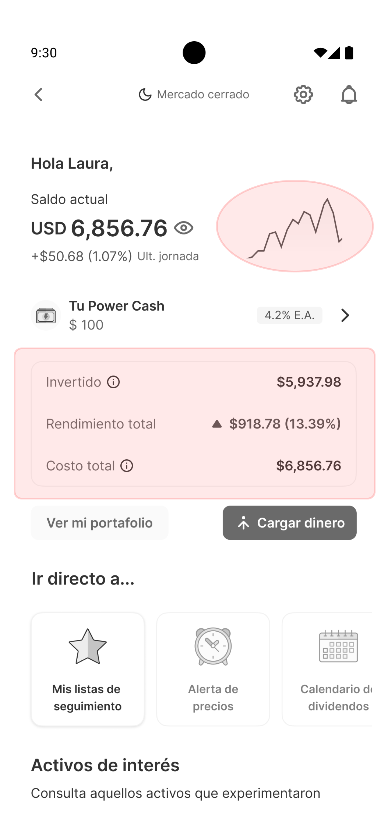
Clarity of information
The graph with no time references and some terms in the investment summary can create ambiguity for users with little experience in financial markets.
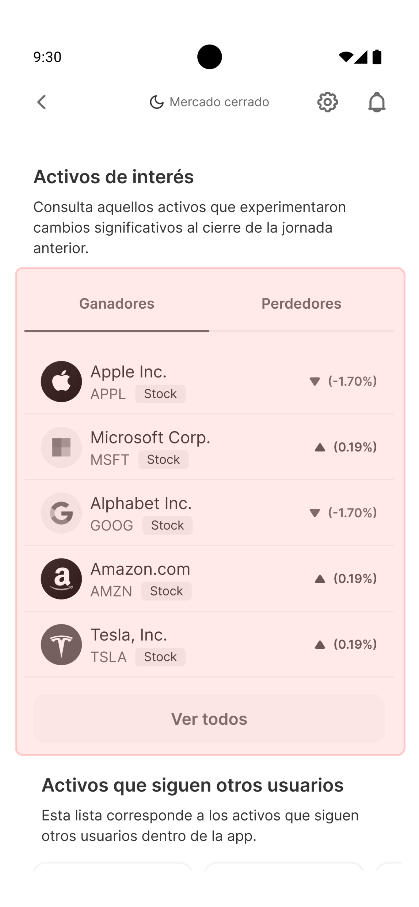
Section architecture
The density of elements on the home makes this section fail to stand out — although its content is relevant for those monitoring market behavior, it visually dilutes among the other zones.
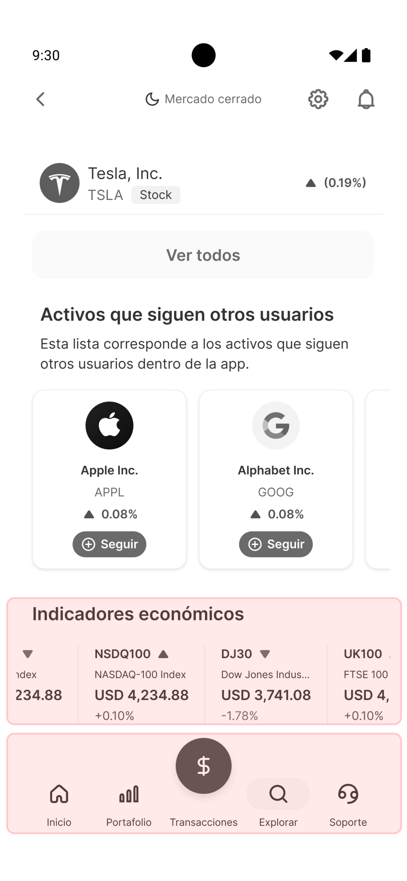
Relevance and coherence
Some components don't respond to needs identified by users, and the stocks product's navbar has a different navigation structure than the rest of the app — affecting the coherence of the ecosystem.
THE PROCESS
Two fronts, one same question: what should the home show?

ideation
Internal architecture workshop
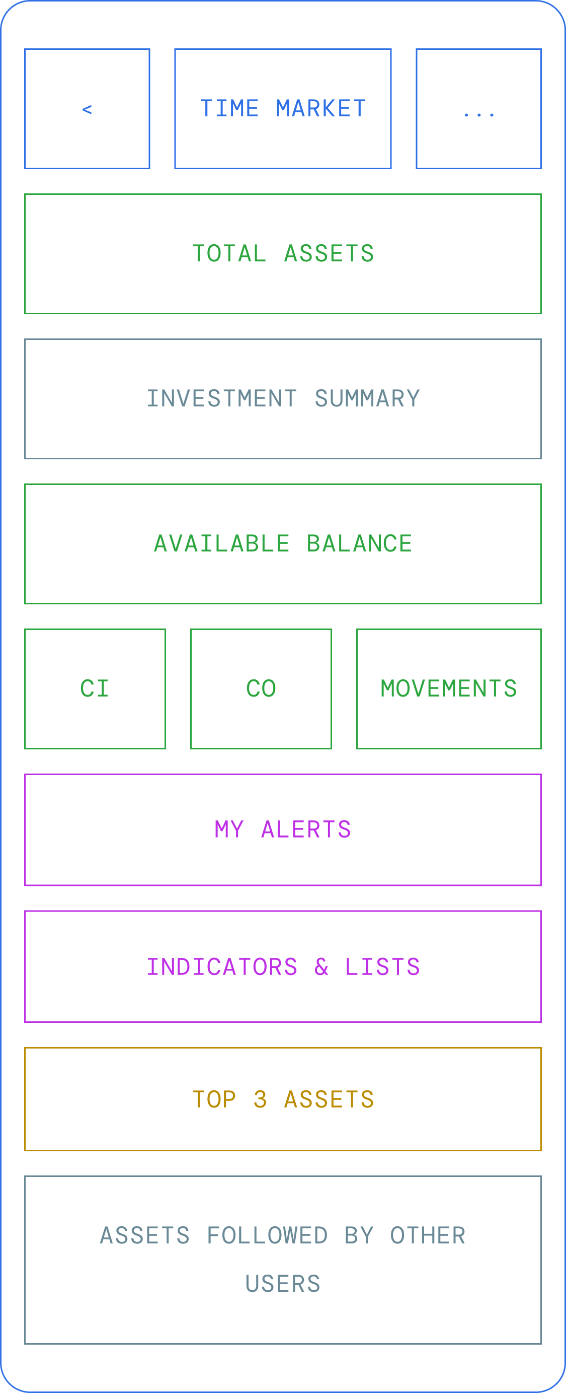
The team — technical and product — reorganized the home through a collaborative wireframing exercise based on their own experience. The dynamic allowed evaluating the home across five dimensions: visual clarity, language, personalization, navigation, and value proposition. The exercise helped identify patterns and name, for the first time, problems the team had sensed but never articulated.
13 PARTICIPANTS · MULTIDISCIPLINARY

qualitative
User interviews + card sorting
International stocks users took part in interviews to identify perceptions, pain points, and opportunities in the product. At the close of each interview, they organized the home's current components using a relevance scale — and flagged what additional content they needed to make better-informed investment decisions.
15 USERS · BEGINNER · INTERMEDIATE
EC
Consolidated scale
Card sorting - 15 USERS
😊

🤔
HIGH RELEVANCE
Investment summary
13/15
Price alerts
14/15
MEDIUM RELEVANCE
Watchlists
14/15
Asset search
14/15
LOW RELEVANCE
Winners and losers
11/15
Other users' assets
13/15
THE FINDINGS
What we heard — from inside and outside
PART I: COLLABORATIVE WORKSHOP
Every dimension we evaluated crossed the same question: does this generate real value for the user, or does it just take up space?
Insight /
Opportunity Area
01
Lack of hierarchy and visual contrast
The interface doesn't efficiently guide the user, creating cognitive load and confusion in home navigation.
Redefine the home's visual hierarchy to guide the user toward the most relevant content clearly and effortlessly.
02
Confusing data for new users
The presentation of financial information doesn't account for the user's experience level, making it harder to interpret.
Adapt data presentation to the user's level, prioritizing clarity over information density.
03
Technical jargon as a blocker
Specialized language inhibits investment decision-making, especially for beginner users.
Review and simplify the home's terminology so it's accessible without losing financial precision.
04
Non-customizable home
The user is forced to consume information they consider irrelevant, with no tools to adapt the experience.
Design personalization mechanisms that let users decide what content to see and in what order.
05
Zones lost in the noise
The lack of hierarchy makes valuable content invisible within the home.
Establish content zones with differentiated visual weight so each section has clear presence and purpose.
🟣 Home screen architecture proposals — co-created during internal workshop
PART II: USER INTERVIEWS + CARD SORTING
Users are asking for the right content, in the right place.
#
Insight
01
Content prioritization and functional gaps
Users consistently prioritized the zones that let them monitor their investment and make buy or sell decisions. General discovery zones were deprioritized — users who already invest know what they're looking for.
02
Strategy and value
Users identified functionalities that don't currently exist in the product and that they consider necessary for making better investment decisions — more robust tools, clarity on costs and commissions, two-factor authentication, operating on a web platform, among others.
03
Risk and trust
Users expressed doubts about the product's transparency around costs, commissions, and taxes. The lack of clarity in this information creates distrust and inhibits decision-making.
04
Experience and usability
Users reported functional frictions that go beyond the home — operating hours, market schedule limitations, and insufficient tools for technical analysis.
🟣 Visual — SELECTION OF REPRESENTATIVE FINDINGS · CARD SORTING
THE RECOMMENDATIONS
From consensus to direction
The workshop findings and user feedback didn't just answer the question about the home — they generated an opportunity map for the entire product.
01·DATA
Real-time information
Ensure market data reflects the most recent information available — a trustworthy investment experience depends on users always having up-to-date information to make their decisions.
Implemented
02·PERSONALIZATION
The user as the protagonist
Give users the tools to personalize their home — shifting from "see what the app shows" to "see what I need." An experience that adapts to the user, not the other way around.
In exploration
03·STRUCTURE
Content with purpose
Define a content hierarchy that guides the user's reading — each home zone should be distinguishable, legible, and have a clear purpose.
In exploration
04·CONTENT
Eliminating redundancies
Content on the home and other sections of the product can't be the same. The home should only show what's relevant to the user in that moment.
In exploration
🟣 Design proposal — informed by workshop & card sorting
13
Internal participants
15
Users interviewed
3
Analysis axes
The project started with a question about the home and ended up revealing opportunities for the entire product. The adjustments implemented so far include real-time data, terminology adjustments, clear access to the most-used features, and a real differentiation between the home's content and the rest of the product's sections.
Not everything the workshop and the interviews revealed has been implemented — the team's capacity set the pace. But the project's value isn't only in what was built, but in what was named: for the first time, the team and the users talked about the same product while answering the same question — what should the home actually show?
“When the team and the user talk about the same problem, the solution finds its own way.”
Back to home
CASE 03 · Cross-functional Research
Redefining the home architecture
A product's main screen can't grow without direction.
International Stock Trading
Mixed-methods research
Co-creation
Workshop · Interviews
THE PROBLEM
A screen that grew without strategy
“The team knew something wasn't working. What was missing was evidence to change it.”
The international stocks home screen had accumulated content and updates over time with no underlying strategy. Design and business detected that the information architecture wasn't fully responding to real user needs or to a clear value criterion — it was time to ask, both internally and externally, what that screen should actually show.
Clarity of information
The graph with no time references and some terms in the investment summary can create ambiguity for users with little experience in financial markets.
Section architecture
The density of elements on the home makes this section fail to stand out — although its content is relevant for those monitoring market behavior, it visually dilutes among the other zones.
Relevance and coherence
Some components don't respond to needs identified by users, and the stocks product's navbar has a different navigation structure than the rest of the app — affecting the coherence of the ecosystem.
THE PROCESS
Two fronts, one same question: what should the home show?
ideation
Internal architecture workshop
The team — technical and product — reorganized the home through a collaborative wireframing exercise based on their own experience. The dynamic allowed evaluating the home across five dimensions: visual clarity, language, personalization, navigation, and value proposition. The exercise helped identify patterns and name, for the first time, problems the team had sensed but never articulated.
13 PARTICIPANTS · MULTIDISCIPLINARY
qualitative
User interviews + card sorting
International stocks users took part in interviews to identify perceptions, pain points, and opportunities in the product. At the close of each interview, they organized the home's current components using a relevance scale — and flagged what additional content they needed to make better-informed investment decisions.
15 USERS · BEGINNER · INTERMEDIATE
EC
Consolidated scale
Card sorting - 15 USERS
😊
🤔
HIGH RELEVANCE
Investment summary
13/15
Price alerts
14/15
MEDIUM RELEVANCE
Watchlists
14/15
Asset search
14/15
LOW RELEVANCE
Winners and losers
11/15
Other users' assets
13/15
THE FINDINGS
What we heard — from inside and outside
PART I: COLLABORATIVE WORKSHOP
Every dimension we evaluated crossed the same question: does this generate real value for the user, or does it just take up space?
#
Insight
OPORTUNIDAD de diseño
01
Lack of hierarchy and visual contrast
The interface doesn't efficiently guide the user, creating cognitive load and confusion in home navigation.
Redefine the home's visual hierarchy to guide the user toward the most relevant content clearly and effortlessly.
02
Confusing data for new users
The presentation of financial information doesn't account for the user's experience level, making it harder to interpret.
Adapt data presentation to the user's level, prioritizing clarity over information density.
03
Technical jargon as a blocker
Specialized language inhibits investment decision-making, especially for beginner users.
Review and simplify the home's terminology so it's accessible without losing financial precision.
04
Non-customizable home
The user is forced to consume information they consider irrelevant, with no tools to adapt the experience.
Design personalization mechanisms that let users decide what content to see and in what order.
05
Zones lost in the noise
The lack of hierarchy makes valuable content invisible within the home.
Establish content zones with differentiated visual weight so each section has clear presence and purpose.
🟣 Home screen architecture proposals — co-created during internal workshop
PART II: USER INTERVIEWS + CARD SORTING
Users are asking for the right content, in the right place.
#
Insight
01
Content prioritization and functional gaps
Users consistently prioritized the zones that let them monitor their investment and make buy or sell decisions. General discovery zones were deprioritized — users who already invest know what they're looking for.
02
Strategy and value
Users identified functionalities that don't currently exist in the product and that they consider necessary for making better investment decisions — more robust tools, clarity on costs and commissions, two-factor authentication, operating on a web platform, among others.
03
Risk and trust
Users expressed doubts about the product's transparency around costs, commissions, and taxes. The lack of clarity in this information creates distrust and inhibits decision-making.
04
Experience and usability
Users reported functional frictions that go beyond the home — operating hours, market schedule limitations, and insufficient tools for technical analysis.
🟣 Visual — SELECTION OF REPRESENTATIVE FINDINGS · CARD SORTING
THE RECOMMENDATIONS
From consensus to direction
The workshop findings and user feedback didn't just answer the question about the home — they generated an opportunity map for the entire product.
01·DATA
Real-time information
Ensure market data reflects the most recent information available — a trustworthy investment experience depends on users always having up-to-date information to make their decisions.
Implemented
02·PERSONALIZATION
The user as the protagonist
Give users the tools to personalize their home — shifting from "see what the app shows" to "see what I need." An experience that adapts to the user, not the other way around.
In exploration
03·STRUCTURE
Content with purpose
Define a content hierarchy that guides the user's reading — each home zone should be distinguishable, legible, and have a clear purpose.
In exploration
04·CONTENT
Eliminating redundancies
Content on the home and other sections of the product can't be the same. The home should only show what's relevant to the user in that moment.
In exploration
🟣 Design proposal — informed by workshop & card sorting
13
Internal participants
15
Users interviewed
3
Analysis axes
The project started with a question about the home and ended up revealing opportunities for the entire product. The adjustments implemented so far include real-time data, terminology adjustments, clear access to the most-used features, and a real differentiation between the home's content and the rest of the product's sections.
Not everything the workshop and the interviews revealed has been implemented — the team's capacity set the pace. But the project's value isn't only in what was built, but in what was named: for the first time, the team and the users talked about the same product while answering the same question — what should the home actually show?
“When the team and the user talk about the same problem, the solution finds its own way.”
Back to home
CASE 03 · Cross-functional Research
Redefining the home architecture
A product's main screen can't grow without direction.
International Stock Trading
Mixed-methods research
Co-creation
Workshop · Interviews
THE PROBLEM
A screen that grew without strategy
“The team knew something wasn't working. What was missing was evidence to change it.”
The international stocks home screen had accumulated content and updates over time with no underlying strategy. Design and business detected that the information architecture wasn't fully responding to real user needs or to a clear value criterion — it was time to ask, both internally and externally, what that screen should actually show.
Clarity of information
The graph with no time references and some terms in the investment summary can create ambiguity for users with little experience in financial markets.
Section architecture
The density of elements on the home makes this section fail to stand out — although its content is relevant for those monitoring market behavior, it visually dilutes among the other zones.
Relevance and coherence
Some components don't respond to needs identified by users, and the stocks product's navbar has a different navigation structure than the rest of the app — affecting the coherence of the ecosystem.
THE PROCESS
Two fronts, one same question: what should the home show?
ideation
Internal architecture workshop
The team — technical and product — reorganized the home through a collaborative wireframing exercise based on their own experience. The dynamic allowed evaluating the home across five dimensions: visual clarity, language, personalization, navigation, and value proposition. The exercise helped identify patterns and name, for the first time, problems the team had sensed but never articulated.
13 PARTICIPANTS · MULTIDISCIPLINARY
qualitative
User interviews + card sorting
International stocks users took part in interviews to identify perceptions, pain points, and opportunities in the product. At the close of each interview, they organized the home's current components using a relevance scale — and flagged what additional content they needed to make better-informed investment decisions.
15 USERS · BEGINNER · INTERMEDIATE
EC
Consolidated scale
Card sorting - 15 USERS
😊
🤔
HIGH RELEVANCE
Investment summary
13/15
Price alerts
14/15
MEDIUM RELEVANCE
Watchlists
14/15
Asset search
14/15
LOW RELEVANCE
Winners and losers
11/15
Other users' assets
13/15
THE FINDINGS
What we heard — from inside and outside
PART I: COLLABORATIVE WORKSHOP
Every dimension we evaluated crossed the same question: does this generate real value for the user, or does it just take up space?
#
Insight
OPORTUNIDAD de diseño
01
Lack of hierarchy and visual contrast
The interface doesn't efficiently guide the user, creating cognitive load and confusion in home navigation.
Redefine the home's visual hierarchy to guide the user toward the most relevant content clearly and effortlessly.
02
Confusing data for new users
The presentation of financial information doesn't account for the user's experience level, making it harder to interpret.
Adapt data presentation to the user's level, prioritizing clarity over information density.
03
Technical jargon as a blocker
Specialized language inhibits investment decision-making, especially for beginner users.
Review and simplify the home's terminology so it's accessible without losing financial precision.
04
Non-customizable home
The user is forced to consume information they consider irrelevant, with no tools to adapt the experience.
Design personalization mechanisms that let users decide what content to see and in what order.
05
Zones lost in the noise
The lack of hierarchy makes valuable content invisible within the home.
Establish content zones with differentiated visual weight so each section has clear presence and purpose.
🟣 Home screen architecture proposals — co-created during internal workshop
PART II: USER INTERVIEWS + CARD SORTING
Users are asking for the right content, in the right place.
#
Insight
01
Content prioritization and functional gaps
Users consistently prioritized the zones that let them monitor their investment and make buy or sell decisions. General discovery zones were deprioritized — users who already invest know what they're looking for.
02
Strategy and value
Users identified functionalities that don't currently exist in the product and that they consider necessary for making better investment decisions — more robust tools, clarity on costs and commissions, two-factor authentication, operating on a web platform, among others.
03
Risk and trust
Users expressed doubts about the product's transparency around costs, commissions, and taxes. The lack of clarity in this information creates distrust and inhibits decision-making.
04
Experience and usability
Users reported functional frictions that go beyond the home — operating hours, market schedule limitations, and insufficient tools for technical analysis.
🟣 Visual — SELECTION OF REPRESENTATIVE FINDINGS · CARD SORTING
THE RECOMMENDATIONS
From consensus to direction
The workshop findings and user feedback didn't just answer the question about the home — they generated an opportunity map for the entire product.
01·DATA
Real-time information
Ensure market data reflects the most recent information available — a trustworthy investment experience depends on users always having up-to-date information to make their decisions.
Implemented
02·PERSONALIZATION
The user as the protagonist
Give users the tools to personalize their home — shifting from "see what the app shows" to "see what I need." An experience that adapts to the user, not the other way around.
In exploration
03·STRUCTURE
Content with purpose
Define a content hierarchy that guides the user's reading — each home zone should be distinguishable, legible, and have a clear purpose.
In exploration
04·CONTENT
Eliminating redundancies
Content on the home and other sections of the product can't be the same. The home should only show what's relevant to the user in that moment.
In exploration
🟣 Design proposal — informed by workshop & card sorting
13
Internal participants
15
Users interviewed
3
Analysis axes
The project started with a question about the home and ended up revealing opportunities for the entire product. The adjustments implemented so far include real-time data, terminology adjustments, clear access to the most-used features, and a real differentiation between the home's content and the rest of the product's sections.
Not everything the workshop and the interviews revealed has been implemented — the team's capacity set the pace. But the project's value isn't only in what was built, but in what was named: for the first time, the team and the users talked about the same product while answering the same question — what should the home actually show?
“When the team and the user talk about the same problem, the solution finds its own way.”
Back to home