CASE 02 · DIAGNOSIS
Watchlist
Data found what the product hadn't tapped into yet.
International Stock Trading
Strategic design
High post-launch adoption

THE PROBLEM
A behavior that data identified, business prioritized, and design executed
“A user who follows an asset is one step closer to investing in it. The challenge was making that step more intentional.”
There was a basic asset-tracking mechanism — users could mark an asset as a favorite from the app's general listings, the asset detail, or search, and it would automatically be added to a simple list on the dashboard. There was no obvious usability problem, but the data team identified something relevant: users who followed assets had a higher likelihood of making their first investment.
That finding was enough for business and design to align on the same direction — leveraging that behavior by redesigning the experience around it.
THE PROCESS
Before designing, we understood what the competition was doing

Analysis
Competitive benchmark
Three investment platforms were reviewed — Trii, Investing, and XTB — with one specific question: what does the product let the user do after following an asset? The focus wasn't visual design but the behavior that enables the feature and the real value it generates for the user.
Trii · investing · XTB

Feasibility
Technical validation
In parallel with the benchmark, we validated with the development team what was feasible to build. That conversation was the starting point for design decisions — not designed on assumptions, but on what was viable to execute.
dev · 3 MONTHS
🟣 VISUAL — STATE PRIOR TO INTERVENTION
01
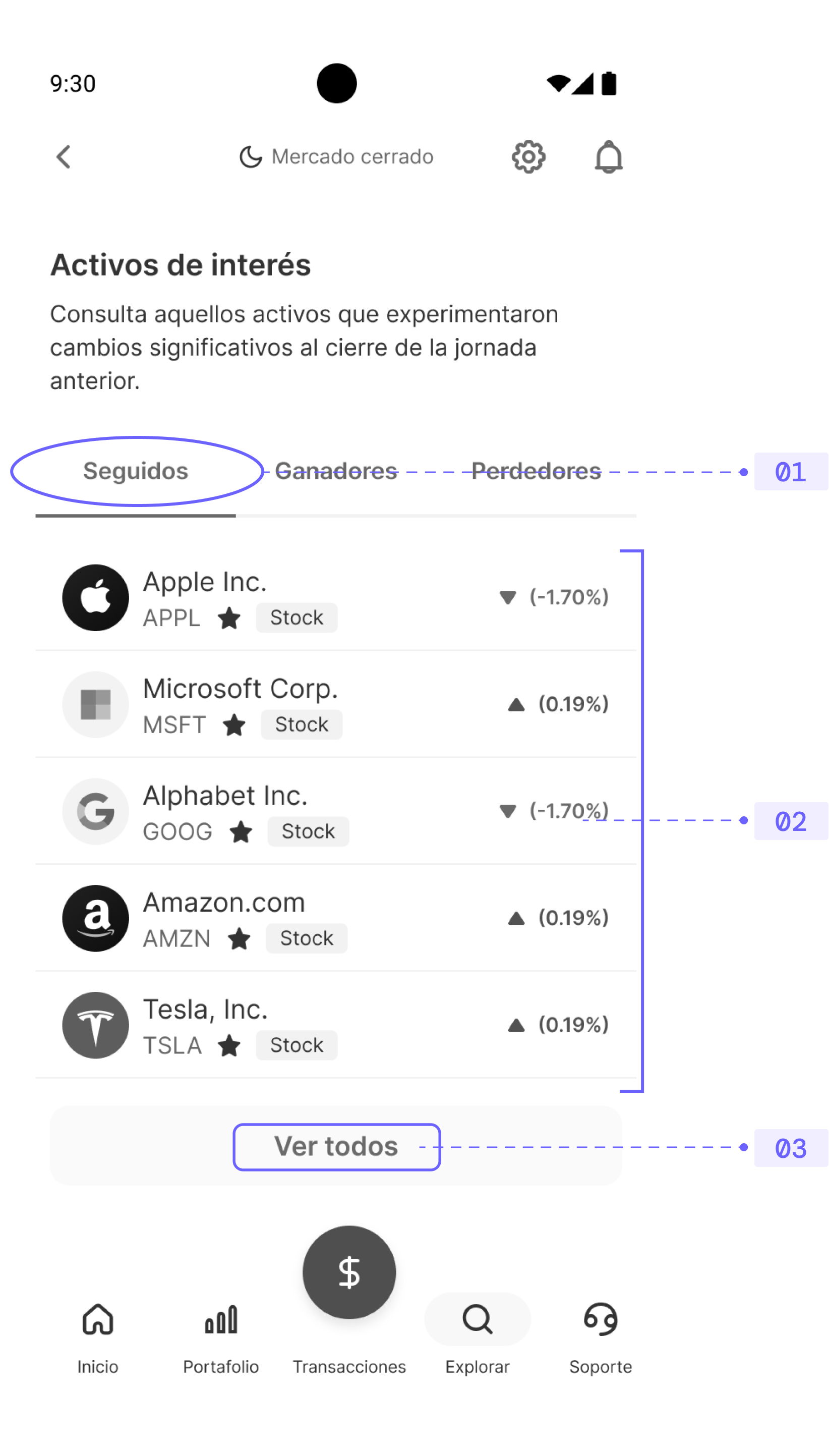
Followed assets piled up in a single list on the dashboard. No structure, no context, and no clear reason to come back and check it.
02
There was no way to organize the list. All followed assets lived at the same level, with no hierarchy or prioritization criteria.
03
Accessing the full list didn't solve anything — it was the same flat list, just longer. No tools to manage it.
THE FINDINGS
What we found — and the space that opened up
Trii was too basic. XTB was hard to navigate. Investing was too dense. None of them solved the three key moments: finding, organizing, and returning.
Insight /
Design Opportunity
01
Trii · View without managing
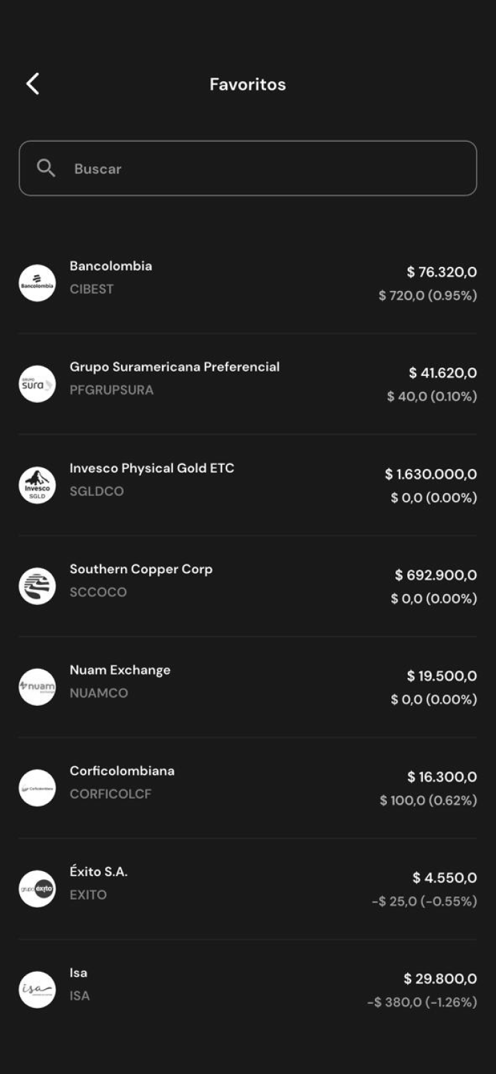
Access from the dashboard is visible, but the experience within the list is limited to viewing — there's no management, no personalization, no actions beyond seeing followed assets.
Design an experience that goes beyond viewing — letting the user organize, prioritize, and personalize their tracking.
02
XTB · Three chained frictions
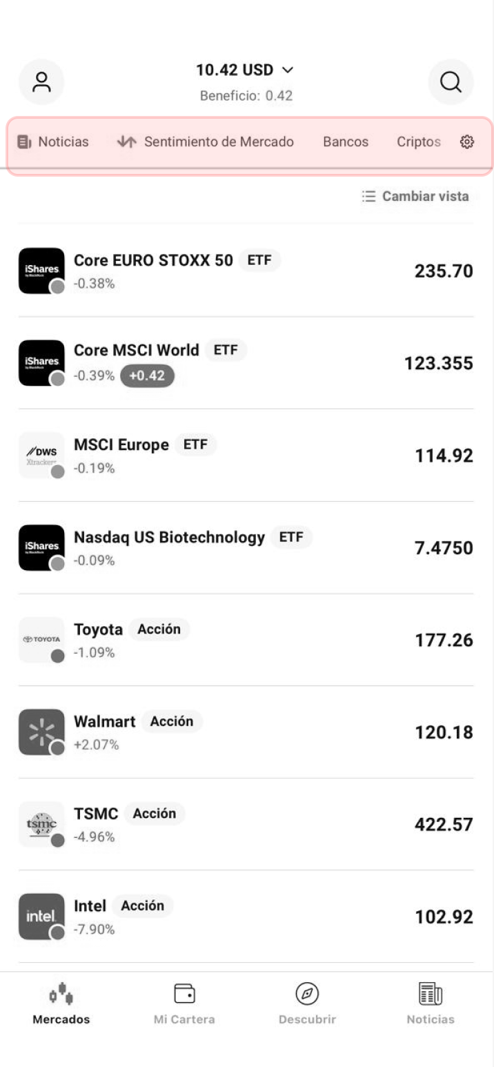
Following an asset requires exploring the top bar icons within the detail view — it's not obvious. Groups can be created and named, but with no visual identity. On the dashboard, they end up at the end of a horizontal scroll across multiple tabs, with no clear hierarchy.
Solve the three chained frictions: make the follow access visible, give identity to the groups, and ensure users can find them from the dashboard without complicated exploration.
03
Investing · Overwhelming functionality
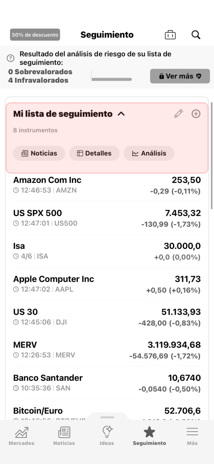
Access from the navbar is direct and allows reorganizing assets, but it crowds too many functions into a single view — news, analysis, details, and reorganization compete with each other, creating a dense experience.
Diseñar una sección enfocada — con las acciones justas y una jerarquía clara que no compita con el objetivo principal del usuario.
Trii
Favorites view — flat list, no actions available beyond scrolling.
XTB
Main dashboard — watchlist groups are hidden behind multiple entry tabs.
Investing
Watchlist view — simultaneously visible functions compete for the user's attention.
THE SOLUTION
From opportunity to decisions
01·STRUCTURE
Multiple watchlists
We designed a system where users can create up to 15 lists, grouping assets by their own criteria — by sector, by investment timing, by interest level, etc. A structure that gives users full control over how they organize their tracking.
Production · Feb 2025
02·IDENTITY
Personalization with name, avatar & drag & drop
Each list has a name, a selectable avatar from the app's visual system, and the ability to reorganize assets within it via drag & drop — letting users prioritize by interest level. Decisions designed so lists feel personal and have more reasons to be checked.
Production · Feb 2025
03·VISIBILITY
Direct access from the dashboard
Watchlists were integrated as a dedicated widget within "Quick Access" on the product's dashboard — at the same level as other features e.g. Price Alerts. Immediate, frictionless access from the very first point of contact with the product.
Production · Feb 2025
🟣 Final screens — Watchlist dashboard, alert management, list creation & detail view
🟣 prototype — watchlist
+200%
Monthly adoption increase
44%
Of followed assets resulted in an investment
11%
Of non-invested users converted after following an asset
Before the redesign, the data point that triggered the project was clear: users who followed assets were significantly more likely to invest. The hypothesis was that increasing this adoption would shorten the distance to a first investment.
Following the February 2025 launch, monthly adoption grew more than 3x and held at that level — more users using the watchlist than in any previous month. And the correlation was confirmed: 11% of users who hadn't made their first deposit converted after starting to follow at least one asset. 44% of watchlisted assets resulted in a real investment.
While the data as a whole can't attribute the impact exclusively to the feature — market behavior also played a role — the starting hypothesis held up with post-launch evidence.
🟣 Visual — MONTHLY WATCHLIST ADOPTION GROWTH
“Sometimes design work doesn't start with a problem — it starts with a signal. This was one of those times.”
See next case →
CASE 02 · DIAGNOSIS
Watchlist
Data found what the product hadn't tapped into yet.
International Stock Trading
Strategic design
High post-launch adoption
THE PROBLEM
A behavior that data identified, business prioritized, and design executed
“A user who follows an asset is one step closer to investing in it. The challenge was making that step more intentional.”
There was a basic asset-tracking mechanism — users could mark an asset as a favorite from the app's general listings, the asset detail, or search, and it would automatically be added to a simple list on the dashboard. There was no obvious usability problem, but the data team identified something relevant: users who followed assets had a higher likelihood of making their first investment.
That finding was enough for business and design to align on the same direction — leveraging that behavior by redesigning the experience around it.
THE PROCESS
Before designing, we understood what the competition was doing
Analysis
Competitive benchmark
Three investment platforms were reviewed — Trii, Investing, and XTB — with one specific question: what does the product let the user do after following an asset? The focus wasn't visual design but the behavior that enables the feature and the real value it generates for the user.
Trii · investing · XTB
Feasibility
Technical validation
In parallel with the benchmark, we validated with the development team what was feasible to build. That conversation was the starting point for design decisions — not designed on assumptions, but on what was viable to execute.
dev · 3 MONTHS
🟣 VISUAL — STATE PRIOR TO INTERVENTION
01
Followed assets piled up in a single list on the dashboard. No structure, no context, and no clear reason to come back and check it.
02
There was no way to organize the list. All followed assets lived at the same level, with no hierarchy or prioritization criteria.
03
Accessing the full list didn't solve anything — it was the same flat list, just longer. No tools to manage it.
THE FINDINGS
What we found — and the space that opened up
Trii was too basic. XTB was hard to navigate. Investing was too dense. None of them solved the three key moments: finding, organizing, and returning.
#
Insight
Design Opportunity
01
Trii · View without managing
Access from the dashboard is visible, but the experience within the list is limited to viewing — there's no management, no personalization, no actions beyond seeing followed assets.
Design an experience that goes beyond viewing — letting the user organize, prioritize, and personalize their tracking.
02
XTB · Three chained frictions
Following an asset requires exploring the top bar icons within the detail view — it's not obvious. Groups can be created and named, but with no visual identity. On the dashboard, they end up at the end of a horizontal scroll across multiple tabs, with no clear hierarchy.
Solve the three chained frictions: make the follow access visible, give identity to the groups, and ensure users can find them from the dashboard without complicated exploration.
03
Investing · Overwhelming functionality
Access from the navbar is direct and allows reorganizing assets, but it crowds too many functions into a single view — news, analysis, details, and reorganization compete with each other, creating a dense experience.
Diseñar una sección enfocada — con las acciones justas y una jerarquía clara que no compita con el objetivo principal del usuario.
Trii
Favorites view — flat list, no actions available beyond scrolling.
XTB
Main dashboard — watchlist groups are hidden behind multiple entry tabs.
Investing
Watchlist view — simultaneously visible functions compete for the user's attention.
THE SOLUTION
From opportunity to decisions
01·STRUCTURE
Multiple watchlists
We designed a system where users can create up to 15 lists, grouping assets by their own criteria — by sector, by investment timing, by interest level, etc. A structure that gives users full control over how they organize their tracking.
Production · Feb 2025
02·IDENTITY
Personalization with name, avatar & drag & drop
Each list has a name, a selectable avatar from the app's visual system, and the ability to reorganize assets within it via drag & drop — letting users prioritize by interest level. Decisions designed so lists feel personal and have more reasons to be checked.
Production · Feb 2025
03·VISIBILITY
Direct access from the dashboard
Watchlists were integrated as a dedicated widget within "Quick Access" on the product's dashboard — at the same level as other features e.g. Price Alerts. Immediate, frictionless access from the very first point of contact with the product.
Production · Feb 2025
🟣 Final screens — Watchlist dashboard, alert management, list creation & detail view
🟣 VISUAL — prototype watchlist
+200%
Monthly adoption increase
44%
Of followed assets resulted in an investment
11%
Of non-invested users converted after following an asset
Before the redesign, the data point that triggered the project was clear: users who followed assets were significantly more likely to invest. The hypothesis was that increasing this adoption would shorten the distance to a first investment.
Following the February 2025 launch, monthly adoption grew more than 3x and held at that level — more users using the watchlist than in any previous month. And the correlation was confirmed: 11% of users who hadn't made their first deposit converted after starting to follow at least one asset. 44% of watchlisted assets resulted in a real investment.
While the data as a whole can't attribute the impact exclusively to the feature — market behavior also played a role — the starting hypothesis held up with post-launch evidence.
🟣 Visual — MONTHLY WATCHLIST ADOPTION GROWTH
“Sometimes design work doesn't start with a problem — it starts with a signal. This was one of those times.”
See next case →
CASE 02 · DIAGNOSIS
Watchlist
Data found what the product hadn't tapped into yet.
International Stock Trading
Strategic design
High post-launch adoption
THE PROBLEM
A behavior that data identified, business prioritized, and design executed
“A user who follows an asset is one step closer to investing in it. The challenge was making that step more intentional.”
There was a basic asset-tracking mechanism — users could mark an asset as a favorite from the app's general listings, the asset detail, or search, and it would automatically be added to a simple list on the dashboard. There was no obvious usability problem, but the data team identified something relevant: users who followed assets had a higher likelihood of making their first investment.
That finding was enough for business and design to align on the same direction — leveraging that behavior by redesigning the experience around it.
THE PROCESS
Before designing, we understood what the competition was doing
Analysis
Competitive benchmark
Three investment platforms were reviewed — Trii, Investing, and XTB — with one specific question: what does the product let the user do after following an asset? The focus wasn't visual design but the behavior that enables the feature and the real value it generates for the user.
Trii · investing · XTB
Feasibility
Technical validation
In parallel with the benchmark, we validated with the development team what was feasible to build. That conversation was the starting point for design decisions — not designed on assumptions, but on what was viable to execute.
dev · 3 MONTHS
🟣 VISUAL — STATE PRIOR TO INTERVENTION
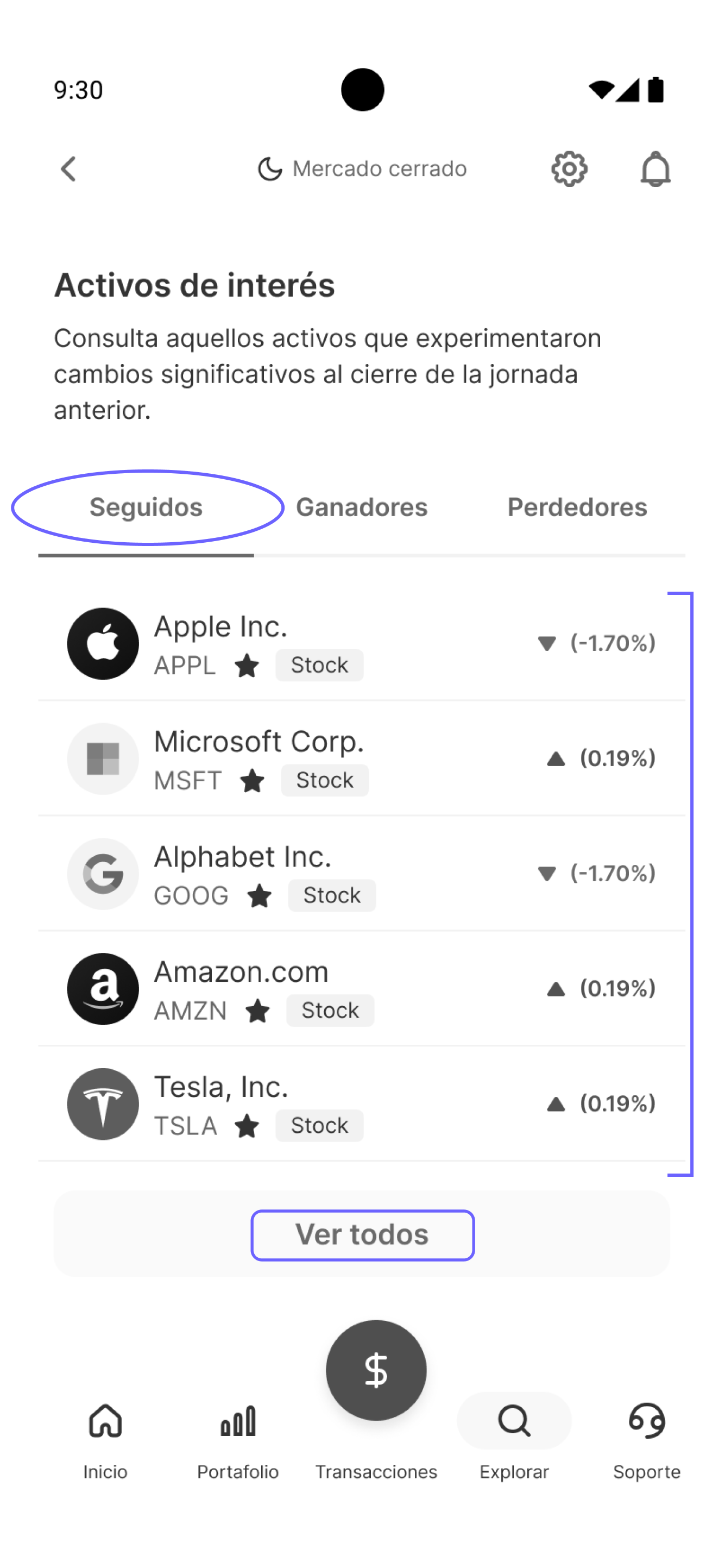
01
Followed assets piled up in a single list on the dashboard. No structure, no context, and no clear reason to come back and check it.
02
There was no way to organize the list. All followed assets lived at the same level, with no hierarchy or prioritization criteria.
03
Accessing the full list didn't solve anything — it was the same flat list, just longer. No tools to manage it.
THE FINDINGS
What we found — and the space that opened up
Trii was too basic. XTB was hard to navigate. Investing was too dense. None of them solved the three key moments: finding, organizing, and returning.
#
Insight
Design Opportunity
01
Trii · View without managing
Access from the dashboard is visible, but the experience within the list is limited to viewing — there's no management, no personalization, no actions beyond seeing followed assets.
Design an experience that goes beyond viewing — letting the user organize, prioritize, and personalize their tracking.
02
XTB · Three chained frictions
Following an asset requires exploring the top bar icons within the detail view — it's not obvious. Groups can be created and named, but with no visual identity. On the dashboard, they end up at the end of a horizontal scroll across multiple tabs, with no clear hierarchy.
Solve the three chained frictions: make the follow access visible, give identity to the groups, and ensure users can find them from the dashboard without complicated exploration.
03
Investing · Overwhelming functionality
Access from the navbar is direct and allows reorganizing assets, but it crowds too many functions into a single view — news, analysis, details, and reorganization compete with each other, creating a dense experience.
Design a focused section — with just the right actions and a clear hierarchy that doesn't compete with the user's main objective.
Trii
Favorites view — flat list, no actions available beyond scrolling.
XTB
Main dashboard — watchlist groups are hidden behind multiple entry tabs.
Investing
Watchlist view — simultaneously visible functions compete for the user's attention.
THE SOLUTION
From opportunity to decisions
01·STRUCTURE
Multiple watchlists
We designed a system where users can create up to 15 lists, grouping assets by their own criteria — by sector, by investment timing, by interest level, etc. A structure that gives users full control over how they organize their tracking.
Production · Feb 2025
02·IDENTITY
Personalization with name, avatar & drag & drop
Each list has a name, a selectable avatar from the app's visual system, and the ability to reorganize assets within it via drag & drop — letting users prioritize by interest level. Decisions designed so lists feel personal and have more reasons to be checked.
Production · Feb 2025
03·VISIBILITY
Direct access from the dashboard
Watchlists were integrated as a dedicated widget within "Quick Access" on the product's dashboard — at the same level as other features e.g. Price Alerts. Immediate, frictionless access from the very first point of contact with the product.
Production · Feb 2025
🟣 Final screens — Watchlist dashboard, alert management, list creation & detail view
🟣 prototype — watchlist
+200%
Monthly adoption increase
44%
Of followed assets resulted in an investment
11%
Of non-invested users converted after following an asset
Before the redesign, the data point that triggered the project was clear: users who followed assets were significantly more likely to invest. The hypothesis was that increasing this adoption would shorten the distance to a first investment.
Following the February 2025 launch, monthly adoption grew more than 3x and held at that level — more users using the watchlist than in any previous month. And the correlation was confirmed: 11% of users who hadn't made their first deposit converted after starting to follow at least one asset. 44% of watchlisted assets resulted in a real investment.
While the data as a whole can't attribute the impact exclusively to the feature — market behavior also played a role — the starting hypothesis held up with post-launch evidence.
🟣 Visual — MONTHLY WATCHLIST ADOPTION GROWTH
“Sometimes design work doesn't start with a problem — it starts with a signal. This was one of those times.”
See next case →